Quantcast
Channel: William O'Connor Studios
Viewing all 60 articles
Browse latest View live

Making Choices

$
0
0
Someone much wiser than me once said, "To be an artist is to make choices."  Do I use oil or digital? Canvas or panel?  Horizontal or Vertical?  Abstract or figurative?  Cobolt Blue or Aquamarine?    Every brush stroke that  a painter makes is a little choice.

As a commercial artist I am constantly reminded that most of these choices are not up to me.  Illustration, concept art and commercial art are collaborative.  There are art directors, editors, authors, marketing directors and advertising considerations that are making choices with you. So it is very enjoyable when I am given the opportunity to make many of the choices myself.

It is about 3 months until Illuxcon in Allentown, PA.  An event that I look forward to every year.  Its a chance to spend time with a small group of dedicated painters and enthusiasts and share ideas and the work we've been doing for the past year and talk freely without the censoring presence of art directors looming around the corner.

Every year I like to do at least one painting for myself without the restrictions of the client.  This year however I thought I would recruit the help of you, my audience.  Usually, the public is the last to see my work, after its been notated, changed, color proofed and edited.  In this instance I'd like you to be the first to see it and to help me make the choices.

First, The Composition.  I have already made several choices at this point.  This is going to be an oil painting 17"x48", Why?  I like to work in odd formats, and to be honest, I have an empty frame that I sold the painting out of. (Choices.)

Below I have three concept sketches for three possible paintings.  I only have time in my schedule to do one.  Please leave a note suggesting which one you feel would make the best painting.  I'm not promising that I will adhere to the majority, but this could be fun.

As the painting progresses I will share color comps and WIP images to enlist your suggestions again as the painting develops.

Thanks in advance.

Enjoy.

WOC


The Oracle 

"This image was inspired directly from the photo reference. The ominous lighting reminded me of a Pyle or Sargent painting.  This painting would be very dark with a lot of tonal variations and texture, contrasting against the smooth skin of the figure.  Unfortunately this image is very similar in theme to another painting I completed earlier this year including a mythological nude with tree branches. I might be willing to present them as a set."


The Riddenmark

"Inspired by bonsai design this image depicts the windswept plains of Rohan from The Lord of the Rings.  I envision the golden fields of wheat shimmering in the dappled sun.  The winds of war stir the clouds.  The aged tree represents King Theodin, bent and worn, but not broken.  Legolas, Aragorn and Gimli look out across the plain."


Prospero and Miranda: from The Tempest

"This image has been hanging next to my easel for months taunting me.  I love the emotion and the tenderness.  As a father I'm drawn to the narrative.  Steel Grey storm clouds breaking as the storm abates, and fresh sunlight spills across the couple.  Every time I think I'm ready to start I become daunted by the level of work involved, and find something easier to do."


©William O'Connor Studios

Midgard Tales

$
0
0
The following is a series of work in progress images that I did for a commission from Kobold Quarterly....

Enjoy-

WOC


Artist of the Month:Bruegel

$
0
0
http://muddycolors.blogspot.com/2013/08/artist-of-month-bruegel.html

The Riddermark

$
0
0
The following is a series of images of a personal work.


"The Riddermark"
17"x48" oil on panel
©William O'Connor 2013

Enjoy.

WOC


The Art of Health

$
0
0
When I started painting at the age of ten in the atelier of The Huntington School of Fine Arts, I remember my teacher, Joe Mack, telling us that we couldn't sit.  Art was a whole body experience that had to be done standing up!

When I got to college I recall an assembly lecture for all artists regarding the health hazards of the artist.  Everything from toxic photography liquids to the dangers of turpentine fumes and the health risks of heavy metals such as cobolt, lead and cadmium for the painters.  I was nineteen at the time and took little heed of the warnings.  What they didn't teach us was the the long term physical damage of the arts.

As a forty-plus year old artist who has been painting for thirty of those years, I assumed that cancer and organ failure was to be my cause of death due to toxic exposure to paint.  Little did I know that my body would fail long before the paint ever got to me!

I have, for the past five years, endured excruciating chronic pain in the form of a herniated lumbar disk in my lower back.  The cause, as every orthopedist I've talked to claims, is being hunched over a drafting table and painting easel for the past thirty years. 

The long term physical effects to the artist are varied including carpel tunnel in your hands, myopia in your eyes due to straining over minute details, and as I have experienced, a bad back from bending over your work.  This is nothing new of course. In researching famous artists this is a condition that is quite common over the centuries.

Unfortunately for the freelance artist there is no Worker's Comp or Disability Insurance. you just have to suck it up and keep painting.  I only wish that that I had heeded my childhood teacher and continued to paint standing up.

Good Health and Good Luck.

WOC

Above:
"Self portrait"
William O'Connor


Stone Circle

$
0
0
In the spring of 1992 I was a senior art student at Alfred University.  I had spent four years studying art, history philosophy, and literature.  I had met a whole cadre of new people, and the person I was leaving was very different than the person I had been when I had arrived as a high school student of 17.  Hundreds of paintings, dozens of sculptures, thousands of photographs, a half dozen acting roles and my first illustration commission, and I was leaving, forever, for the real world.

Most seniors just carve their names into a tree or a dorm wall (which I did), but I wanted to leave something bigger.  Something that really spoke to my transformation as a person, and that truly marked the places that meant the most to me.

Alfred was a rural college.  A short walk off campus you could climb the fields and hills that overlooked the campus valley, listen to the carillon echoing and for four years I had climbed those hills in rain and snow and sun, and they had a lasting effect on me.  In April of 1992, with my graduation looming I began reflecting and to construct a monument to my time at Alfred on the green hills overlooking the valley where I had spent so many pleasant afternoons wandering.

I began with one stone.  That one stone became more and over the next several weeks as I returned to the hill top and lugged the heavy slabs of rock that generations of farmers had discarded to the wood line back into the center of the field.  What had started as a simple cairn became a stone circle, about ten feet in diameter, approximately three courses tall.   In the end I felt satisfied and upon my graduation I left Alfred expecting never to return, and assuming that the circle would be plowed under the following spring.

Today, I realize with the advent of satellite photography that my little stone circle, 22 years old at the time of this blog, still stands, much to my surprise.  If you are ever in Alfred New York, and happen to climb the Pine Hill just south of campus, up the fire road, past the water tower and into the fields.  At the top of the ridge you should find the broken remains of my stone circle.


Enjoy

WOC

SmallCon, Big Weekend!

$
0
0
Boston, Ma Waterfront
I attended and displayed in my first science fiction-fantasy art show at the 1992 World Fantasy Convention in Atlanta.  Since then I regularly began attending about five shows a year all over the United States.  That makes over 100 art shows in my career that I have been to.  Some as large as San Diego Comic Con with 150,000 visitors and some as small as NeCon with less than 500. 

Both large and small have there advantages.  As the fantasy business becomes more mainstream with video games and films, comics and cosplay the venues have all melded into massive geek-themed South by SouthWest festivals.  Show promoters and the cities that host these shows make a lot of money, as do the artists that attend them.  Over the past decade I have noticed that with demands on my time, I will now do only one or two shows a year at huge convention center venues where I can make more in one weekend than I could at a half dozen small shows.  This is just good business.

But, what about those smaller regional and local shows?  Are they still around, do people still attend, and why as an artist would you want to do one?  That's what this blog is about.

Intimate Venue.  The best part of a small regional show is that it is small.  The atmosphere is very casual and relaxed.  It is possible to sit and spend a lot of time getting to know the fans, the attendees, other artists, and to attend and take part in panels and demonstrations. Most of these small shows are organized by local or regional Science Fiction Clubs so the management is voluntary and they are doing the show for the pure love of the genre. These shows are great times to arrange meetings and dinners with local friends and clients.

Display and Dash.  For me, the best part of a small show is the ability to display and dash.  You arrive on a Friday, set up your display in 30 minutes, and you have until Sunday afternoon to chill out.  You don't have to sit in a booth for ten hours a day.  You don't have to handle money or haggle prices or process credit cards and juggle inventory.  You have a whole weekend to do whatever you want.  This free time is invaluable in business and life.  Some of the best relationships and friends I've made over the past twenty years is with art directors and artists at these small shows.

I recall a World Science Fiction Convention in Boston.  With so much free time I chatted up the senior editor of Doubleday Books, and we ended up having lunch together on a bench in the Boston commons watching the ducks and working on the NY Times crossword.  In 1999 I attended the World Fantasy Convention in Providence RI.  The Senior Creative Director of D&D and I spent Saturday afternoon walking through the galleries of the RISD art museum.  At Lunacon in NY a group of art friends and myself decided to take advantage of the warm spring weather and walked around the sculpture gardens at the nearby PepsiCo campus, and in Saratoga Springs I visited museums, galleries, battlefields and the best Irish bar in the country with my art friends.

These are just a few examples, but encounters like this are impossible if you are stuck behind a table in a booth signing Magic Cards and selling prints to fans.  It may not seem to pay dividends in immediate cash, but in value as an artist its priceless.

Big Fish, Small Pond:  Your average regional show may have 1500 attendees and a dozen artists.  Of those artists there are perhaps four or five full time professionals.  Even though the attendance is small the odds of selling an original work go up substantially at small shows, and winning an award is almost assured.  Small shows have smaller overhead, so merely selling one piece can cover your expenses.

Destination Venues:  I have attended GenCon Indy in Indianapolis more than ten times and I have never been outside of the convention center and a small three block radius of bars and restaurants, even though there is an art museum and parks within walking distance.  My favorite part of doing small display shows is that it gets you outside to visit the cities you're in.   Museums, parks, historic sites etc, are all available if you have your weekend to yourself.  These days I have a wife and two children with a very busy schedule and vacation time at a premium.  To compromise we will often decide where we want to go, and then see if there is a show in that city, so that I can do an art show and we can all have a vacation.  There are some great, fun and beautiful cities and they all have sci-fi shows, and its all a tax write-off!

Here are some small display shows where you don't have to man a booth in some great cities on the American East Coast.  I'd love to hear your recommendations and experiences for similar shows on the West Coast.
I'm rating each from one to five stars based on Quality of Venue, Quality of the Art Show, and Quality of the City. The cost of the Art Show I'm basing on buying a full three panel bay and membership.

Boskone.  Boston, MA. February (New England Science Fiction Association NESFA)
Rating: *****
Artshow: 30 artists, 8-10 FT professionals.
Cost: Artshow and Membership $200 Hotel: $150/day.
Venue: Boston Westin Waterfront
Attendance: 2000
What to do: Boston is an amazing town, even in February, and the venue is right in the middle of it in a beautiful new Westin Hotel.  The show is well run and attended by fans and artists.  Sales are generally reliable. The Boston Art Museum, The Public Library, The Freedom Trail, Boston Commons, The Aquarium and great food, shopping and bars makes this a must-do show for me and my family every year.
Website: http://www.nesfa.org/boskone/

Lunacon. Rye, NY. March (New York Science Fiction Association)
Rating:**
Artshow: 20 artists.  4-6 FT professionals
Cost: Membership and Artshow: $150 Hotel $120/day
Venue: Ryebrook NY Hilton
Attendance: 800
What to do: Lunacon was the must-attend artshow every year when I was starting out.  It was the show for all the Art Directors and Artists that lived in and around Manhattan, showcasing 100 artists with 15-20 FT professionals and about 3000 attendees. With competition from Illuxcon and Spectrum Live artists from the region have stopped coming, and with NY Comic Con the fans have stopped coming as well.  The venue is about 20 min. north of Manhattan by train.  If you are looking for an excuse to make a trip to NYC this is the best opportunity for a Destination Venue for the greatest museums and restaurants in the country, and perhaps drop off some portfolios at the publishing houses.
website: http://2014.lunacon.org/


Balticon. Baltimore, MD. May
Rating: (I haven't attended recently enough to rate it.)
Artshow:
Cost:
Venue: Hunt Valley Inn. Hunt Valley MD.
Attendance:
What to Do:  Edgar Allen Poe's Gravesite, the Waterfront, Camden Yard Baseball, The Baltimore Museum of Art, The Aquarium and a day trip to Hersey Park make this a fun trip for families.  Always held for four days over Memorial Day Weekend.
website:http://www.balticon.org/


Philcon. Philadelphia, PA (Cherry Hill, NJ). November
Rating:***
Artshow: 20 artists. 4-6 FT professionals
Cost: Membership and Artshow: $150 Hotel: $120/day
Venue: Crowne Plaza Hotel
Attendance: 1000
What to do: Although the venue is just over the river into NJ, Philadelphia is a beautiful destination city that's worth seeing.  The Philadelphia Acadamy of Fine Arts, Philadelphia Art Museum, The Rodin Museum, The Philadelphia Zoo, Liberty Park, and Terminal Market make it a great family trip  or for any serious artist. 

World Fantasy Convention. October
Rating;****
Artshow: 50 artists.  10-20 FT professionals.
Cost: Membership and Artshow: $500 Hotel: varies.
Venue: varies.
Attendance: 1500
What to do: I have had some of the best times in my career at the "World" shows.  Every one takes place in a new city each year, so I pick and choose by what city I want to go to.  I never fly or travel internationally with my art, ( its cost prohibitive) so that leaves  me attending these about once every four years.  Baltimore, Boston, Providence, Madison, Columbus, Chicago, Atlanta and Saratoga Springs (my favorite)  were all great shows, generally attended by serious fans and professional artists and art directors resulting in good contacts, good sales and a great time.
 This years show is in Washington DC!  The National Gallery, The Smithsonian, The Air and Space Museum, National Arboretum and the restaurants in Georgetown alone will make it worth the trip!
website:http://www.worldfantasy.org/

World Science Fiction Convention. August
Rating:****
Artshow: 50 artists.  10-20 FT professionals.
Cost: Membership and Artshow: $500 Hotel: varies.
Venue: varies.
Attendance: 1500
What to do: The World Science Fiction Convention is like the Sci-Fi Oscars, where the Hugo Awards are given out each year. Every one takes place in a new city each year, so I pick and choose by what city I want to go to.  Generally attended by serious fans and professional artists and art directors resulting in good contacts, good sales and a great time.  Similar audience to World Fantasy.
website: http://www.worldcon.org/


The Minotaur

$
0
0
 
Recently working on a concept project for a client I have been exploring the art and the myth of the Minotaur. At first glance we are all familiar with the fantasy monster of half man -  half bull that lurks in the bowels of ancient labyrinths. This has been a staple of gaming and stories for decades and I myself have faced innumerable minotaurs in cavernous hallways, dispatching them with sword and magic in everything from Dungeons & Dragons to World of Warcraft.

My research into the mythos of the minotaur uncovered a great deal more. When doing a simple Google search for “Minotaur” I was confronted with what seemed a vastly divergent representation of the monster. Everything from classical urns to contemporary game concept art and an unsettling number of erotic hentai depictions of the beast. I came to realize however that all of these are intimately related, and what I thought was a straight forward two-dimensional monster, has revealed centuries of psyco-sexual development.

The original version of the Minotaur story begins in ancient Greece. The monster that is half man half bull is also the half son of King Minos of Crete, born to queen Pasiphae who indulged in bestiality with a bull. Minos imprisoned the monster in an elaborate labyrinth designed by Daedelus. Every year seven youths are sent into the labyrinth to be sacrificed to the Minotaur. The hero Theseus famously brings a spool of thread which he unwinds behind him, and once slaying the monster, follows the thread backward to escape the labyrinth.
The Minotaur GF Watts 1885
But, I’m more interested in the character of the Minotaur himself as an archetypal figure. He has the intellect of a man and the violent virility of a beast. In classical philosophy this was known as the Dionysian/Apollonian Dialectic. The discourse among philosophers such as Socrates as to whether Man was an intellectual creature or a physical creature. Dionysus being the god of hedonism and physical pleasure while Apollo was the God of the arts and science. The Minotaur was a physical manifestation that Man had aspects of both. The cannibalistic devourer of human flesh (figuratively and literally) and conceived by the lustful infidelity of the queen with a bull. This hideous offspring is unwanted and unloved by both his parents and locked away as an embarrassment, while his sister Ariadne is beautiful and adored by everyone. The motif of the labyrinth or maze is universal throughout many cultures as representing the twisting and turning of the path of life, adding to the complex symbolisms of the Minotaur myth.

By the time of The Age of Reason in the 18th century philosophers such as Descartes and Hobbes began to further explore the Duality of Man, later explored by Freidrich Nietzsche in Birth of Tragedy (1891). Was Man an animal with the mind of a god? or a god trapped in the body of an animal? and in what combination did these two aspects of the human condition struggle with each other?
Minotautomachy Pablo Picasso 1934
In the 20th century the advent of psychoanalysis began to codify this duality into a science. Freud’s theory of the Id versus the Ego and Yung’s development of the concept of Archetypes became the leading theories of the day. The classic Oedipus Complex that every man wishes to kill his father and sleep with his mother is deeply represented in the Minotaur myth. The most notorious of artists to explore this theme of the Minotaur was Pablo Picasso. Having spent much of his adult life in dramatic and destructive relationships with a series of women Picasso explored the theme of the Minotaur in a series of drawings and engravings to try to better understand his own subconscious, that of the lecherous, adulterous man who devoured women, in conflict with the intellectual artist who created paintings.
 
Alien Concept Design. H.R. Giger
Today as I explore the infinite realms of the internet I find that depictions of the Minotaur are more common than perhaps anytime in history. In 1979 Ridley Scott produced a sci-fi reimagining of the Minotaur story with Alien, where a group of sacrificial space-miners are hunted in a labyrinth of hallways and access tubes to either be devoured or impregnated by a horrific monster. When concepting the Alien, artist H.R. Giger was noted to have said that he gave the Alien a decisively phallic shape, because that people are equally terrified of sex and death.  Most recently, I think the character of Tyrian Lannister in the story The Game of Thrones, is a literate metaphor of the Minotaur Complex. Finally, there are the crude and pornographic illustrations made by young artists in the form of what is called “hentai”. (I will not display any of these images or link to any sites), but what I at first found disturbing I realized was the same conflict within the minds of young “artists” to try to come to terms with their developing sexualities and intellects. The same dramatic dichotomy that has faced generations of people regarding nascent sexual urges in stark conflict with their intellectual understanding of gender roles, sexuality and societal standards. Viewed from a purely clinical point of view, these outwardly disturbing images are an interesting insight of what originally intrigued the ancient classical poets and artists. Man as sexual and violent animal, versus Man as intellectual and thoughtful citizen. This duality still rages today, and the Minotaur is there uncomfortably in our subconscious thrashing in the labyrinth of our minds threatening to escape.


Enjoy: Go Forth and Learn.

By
Stephen Diamond. Phd

A Gallery of Minotaur Art: 

Theseus Slaying Minotaur Bayre 1845


Pablo Picasso


Minotaur Greek Urn


Karn the Minotaur


Minotaur D&D 1st ed. 1976


©text William O'Connor 2014. All images used for educational and editorial purposes as per the Copyright Code of Fair Use.


Artist Movies

$
0
0
This is not a list of bio-pic movies about famous artists, but movies where the characters are artists. Perhaps some other time I'll make a list of the best bio-pic movies of artists but this one is suggesting films that portray the lifestyle of artists.   Being an artist is extremely solitary and introspective.  It requires that an individual stare into a mirror for a living, and to depict what they see, sometimes for the better, sometimes for the worse, but it always makes for drama.  The films I am suggesting are not in any particular order, and in no way comprehensive, but my personal suggestions that dramatically portray artists and the creative process.


The Door in the Floor (2004) (Rotten Tomatoes 67%)
I can't say I liked this film as much as I loved watching Jeff Bridges as the alcoholic,  psychologically damaged children's book author/illustrator Ted Cole.  The story languidly follows Ted and his wife along with his new apprentice during a summer at their studio/home in the Hamptons.   The tragedy that plagues this dysfunctional family rolls out in a way that begins to illustrate Ted's talent to turn his own history into mythology that through the retelling becomes truth.


Guinevere(1999) (Rotten Tomatoes 86%)
Girls and photography are a cliche and this film of an ugly duckling student who falls for the older photographer, threatens at first to be a straight forward formulaic story.  By the halfway point the characters begin to evolve as the young, impressionable Harper Sloan (Sarah Polley)starts to peer through the cracks of the charming, Irish photographer Connie Fitzpatrick (Stephen Rea) into the reality of the artist's life.  The scene of Harper's mother (Jean Smart) putting the lie to the artist's own self deception is painful as any pretense of artistic brilliance is laid bare.


Speak(2003) (Rotten Tomatoes xx%)

Kristen Stewert as the taciturn PTSD victim Melinda Sordino isn't really acting, she's just being Kristen Stewert, but this does not detract from this touching story of an emotionally scarred student and her art teacher, lovingly and charmingly played by Steve Zahn.  The art in this film is background, almost like another character.  Although it ends feeling a bit like a Lifetime Channel Special, it is still very accurate to the importance and challenge of teaching art to young people.


Art School Confidential (2006)  (Rotten Tomatoes 37%)
Consisting mostly of a sophomoric depiction of the art school and gallery business the plot runs off the rails quickly and can't seem to decide whether to be an irreverent teen flick, or a dark satire.  So why is it on this list?  Two reasons; John Malchovich as the art professor and because even though it was terrible, the story is actually accurate.  The most touching part for me is the character of Audrey (Sophia Miles) who is an art student  and daughter to a once famous painter who's work has fallen out of style.  The touching scene of her visiting her father's poorly attended gallery opening and admitting he should have quit years ago, only to learn that she is becoming an artist to somehow redeem his reputation and the family business was a throw away scene that could have been an entire movie.


New York Stories-Life Lessons(1989) (Rotten Tomatoes 73%)
Probably one of the best depictions of an artist at work ever put to film. Martin Scorsese directs Nick Nolte in part one (Life Lessons) as artist Loinel Dobie.  The sensuous mixture of music, cigarettes, flesh, alcohol and paint is to artists what "Babettes Feast" is to chefs.  This short film about a New York artist and his process of creating one massive canvas while he conversely destroys his relationship with his girlfriend/muse (Rosanna Arqeutte), puts poignant focus on the artist's ability (or need?) to destroy and create at the same time, to draw order and beauty from chaos.


The Fountainhead (1949) (Rotten Tomatoes 83%)
This story of a brilliant young architect who would rather destroy a building than see his vision compromised by a committee of trustees places the concept of artistic integrity literally on trial. Based upon the book by Ayn Rand and starring Gary Cooper as artist Howard Roark this classic is begging for a remake.  I've hated Gary Cooper in every movie he's ever been in, and this film is almost unwatchable, the script is stilted and the performances are cartoonish.  I see Leonardo DeCaprio in the lead as Roark in a remake.


Do you have any suggestions?....let me know in the comments section.


WOC


text©2014.  Film clips and images are used for educational and editorial purposes only.


Will You Look At My Portfolio?

$
0
0

William O'Connor 


Daumier. "The Engraving Collectors"

This is the most common question I receive when doing shows or teaching classes, so I thought I would share my experiences on how to build a portfolio.  I also taught for five years in an art  prep program where our job was to help kids put together portfolios for college presentation.

I have a good friend who is an art director at a major gaming company. One year at San Diego Comic Con she sat at a portfolio review table and looked at aspiring artist's work all week. The lines had stretched around the hall, and on Sunday she had estimated that she had seen over 1000 portfolios. I asked her 'Did you find anything good?' She answered flatly, "Nothing." 

It seemed amazing to me that out of 1000 portfolios she found nothing even remotely usable. The problem was that every single portfolio was the same. Pencil drawings on loose leaf paper of manga characters, superhero panels taken straight from the 'How to Draw the Marvel Comics Way' book, celebrity portraits copied from photographs, and paintings taken right off of on-line workshop challenges. If you have any of these things in your portfolio, Take them out!! 


Here's a few pointers I've learned over my 25 years in the business.

Be Original. Make sure that all of your work is original. Your ideas, your concepts, your designs, your style, and all appearing to be painted by the same artist. If an art director sees ten paintings she may like them all, but if they're all in a different style, they will hesitate to hire you, because you're unpredictable. At the same time you want to show your diversity. Mix up the subject matter, palette, and composition, but keep the theme of the style. Creativity is the key, as you can see by some of the quotes of art advice for portfolios by schools and companies below. You can teach an artist painting or computers or any medium, but you can't teach creativity. That's the one thing all clients are looking for. I've seen Art Directors and Schools take on artists who were obviously substandard technically, but their creativity was amazing.  Being original is very important because even if your work is good, if there are a dozen other artists doing basically the same thing, you've painted yourself out of a job before you've even started.  Being one of 10,000 on an art website will dilute your work by being lumped in with thousands of other artists. You want to stand out from the crowd.  Art directors will encourage you to do similar work as other artists they use, that's their job, they need a ready supply of interchangeable artists to draw from,  but that style will change, or that company will go out of business, or that art director will leave, then you're left with a specialized portfolio for a single client that no longer exists.  Being good will get you work, but being original will get you a career.

Keep it Simple. Less is more. A minimum of eight paintings, no more than twenty in a portfolio. If you're uncertain about a painting, leave it out. We don't need to see everything. As a general rule, an art director will decide whether he likes you or not with the first image. The second image shows that you can repeat the quality, and the third painting just confirms that its not a fluke. Additional images should then show your diversity and range.
Art portfolio web pages have become like art vomitoriums. Remember that an AD or College will judge you on your worst piece. Be careful what you put out there. Pencil doodles and design renders are nice, but don't make an art director sift through fifty unfinished sketches before getting to one finished piece. I can't tell you how many portfolios I've reviewed where the artist said, 'Oh, that's not finished.' Then it shouldn't be in your portfolio. Also, End Strong.  The last image in your folio should be as good as the first.  I've seen so many portfolios that peter out with unfinished sketches in the back.

Presentation.  Both traditional and online portfolios should be neat and easily navigable. If you're showing a client a beat-up sketch book with coffee stains and ripped pages, you've lost it before you even start. Even if the material is decent, the client is going to question the condition of the art they will receive and the attitude that you will give to their project. Colleges will likewise question your dedication. Your work is your life and livelihood, treat it with respect and others will too.
A couple of structural notes on physical portfolios:  Make sure that the pages of the folio turn easily, anything with clip binders will often snag making the presentation awkward.  Place the images in a single orientation so that the client or admissions officer doesn't need to turn the book to look at each image.  Avoid having an image cross the gutter.  Make the book a decent size, and don't skimp on the reproductions.  Very handsome, high resolution 13"x19" prints on archival paper are beautiful, but no bigger.  Also, not to small.  Diminutive little 8x10 Itoya Profolios just seem sad.  Don't leave any blank pages in the back.  Most all, carefully consider the arrangement of your images, they should flow in a  natural way.  Print on demand books are rather affordable these days, and getting one or two portfolios printed is a great option.  It shows your design skills, what your art looks like printed in a book, and it stands out as professional.  These days you could drum up funds to make a Kickstarter portfolio and sell the remainders that you didn't send to art directors.

Be Professional. If you want to be a professional illustrator you have to act like a professional illustrator. Don't waste art directors' time. Do you like getting unsolicited junk mail? Being accosted in hotel lobbies by salesmen? What about those guys on the street handing out coupon flyers? Pop up ads, email bombs, and the worst, being tagged in someone's Facebook photo to get you to look at them?  Multiply that by thousands and you get an idea of an art director's life. Most of those things will be automatically filtered as spam, thrown out, or edited by assistants before the AD even sees them. Art directors love art, and some of the best friendships are between artist and art director, but if you're not getting contacted by art director's, your work isn't ready yet. Standing in line at portfolio reviews, dumping images into slush piles of art drops, and being a nuisance isn't going to make them like you. If you read Art Directors blogs, they are busily looking for new talent. They scour shows, surf the web, read blogs, look at new work all the time. If you're not getting called, its not because they don't see you, don't hassle them! I've had good friends who were art directors that I never worked with. Its not personal. 

The best way to get an art director's attention is to do really great work.  I know that sounds simplistic, but its the surest way to get work.  Win some awards, (Art Directors love awards as much as artists do.) Get into Spectrum, ImagineFX, Society of Illustrators, Expose or some other juried annual, this culls the pack down from hundreds of thousands to just hundreds. Do shows, make a large presence on the web, and keep up a cordial, professional correspondence routine. The rest is up to them. If they don't like your work, you could stand on your head and juggle, it wouldn't make a difference. Stay professional. Don't worry about what one art director says, there are thousands of them out there.  Do the work you love, do it the best you can do it, and the rest will happen. If you seriously want a critique, don't go to a potential client and ask "What don't you like about my portfolio?". Approach another artist, one you admire and respect, who will give you an honest opinion.


Sell It. Remember that you are the salesman of your product. You need to be be your own best advocate of your work. If you're not interested and excited about what you do, no one else will be. I've done reviews where artists say "don't look at that one, its not very good." or when I ask a question about a design or color choice they've made I get a shrug. You need to believe in your work and be proud of it. Be open to critique, but also defend your choices. Art Directors are talented people, but your work needs to be your work, not theirs. Art is a very personal endeavour, you have to do the work you like, because you're going to be doing it for the rest of your life!


The Following are examples of what leading University and Corporations are looking for in artist's portfolios. 

Bioware Inc. Portfolio Submission Guidelines.
"To be a Concept Artist for the games industry, you need the following: Imagination - if you don't have this as a foundation, you will never draw anything uniquely cool or interesting. We have seen plenty of great renderers with no imagination. Those portfolios are tough because the work looks good, but there is not an original idea in the bunch."
 
Mason Gross School of Art, Rutgers University. Portfolio Submission Guidelines.
"Your portfolio...should represent your creativity, potential for artistic growth, dedication to artmaking and working hard, and offer evidence that you have looked at and read a bit about art and its history....Avoid cartoon action figures, monsters, graffiti art, "cutesy" kittens, traditional portraits (drawn from photographs), glamour and fashion advertising images."
 
The School of the Museum of Fine Arts, Boston. Portfolio Submissions Guidelines.
"Technical ability may or may not be considered more important than the creative and artistic efforts evident in your portfolio. We strongly recommend not submitting work copied from photographs or from other artwork. The Admissions Committee is interested in seeing the execution of an original concept."
 
Bizarre Creations Studios. Art Advice.
The things you'll need to show are a varied and creative (yes, creative, not copies of other peoples stuff!) portfolio, showing your talent and enthusiasm for art. It's an idea to show or take along a range of work - paper and computer, from early concept to completed pieces. Having talent is essential, as a talented artist doesn't need experience, and can usually adapt to other media.
 
The Savannah School of Art and Design. Portfolio Submissions Guidelines.
"Applicants should not submit work copied from film, television, photographs, magazine/book illustrations or other sources...Portfolios should include drawings from life, interior and exterior drawings of buildings, and work that demonstrates applicant's personal creativity."


 Enjoy and Good Luck.

WOC


text©2014 William O'Connor


i Illustrator

$
0
0
William O'Connor

I recently spent an afternoon at the local Apple Store getting my iPad worked on, and while sitting there in the gleaming white Sci-Fi retail store, watching my daughter play at the kids table, I wondered at how far this company had come and how influential it has been to me in my life.

My first experience with the Apple Company was in the late '80's.  In 1986 I took what had been called "Typing Class" but had recently been re purposed as "Word Processing" in my high school.  The machine I worked on was the Apple IIe.  It was a crude machine pre-dating even a mouse and all the work had to be done via Syntax Commands and burned to a floppy disk.  Apple had made a genius investment by donating Apple IIe's to schools.  The primary lesson of the class was to learn to type.


In 1991 my family bought their first home computer.  The salesman recommended that my parents get a Mac since they had an artist in the family.  This first Macintosh was very simple and I used it to write my first cover letters to publishing companies and do some simple graphic design to make signs for shows.  By 1995 it had been upgraded with a first generation Internet dial-up modem and I registered my first email address- "wocillo@aol.com". (which still exists somewhere with 1 million emails in its in-box)


In 1997 I had taken a summer graphic design course at the local Tech school and realized that I needed a more powerful computer to run Photoshop and Quark Xpress.  My parents agreed to pay half of the over $3000 price tag of a top-of-the line Power Mac that came complete with built-in Internet modem, CD Rom and a  ZIP Disk Drive!  The monitor was extra and it had to be special ordered from the Mac World catalog.  These were the dark days.  If you wanted a computer you could get a Dell for less than $1000, but if you wanted a GOOD computer it was an investment. This was the time that separates the Apple die-hards from the Apple new-comers.  The Apple Company still owes me for my investment during these times.


By the year 2000 however, Steve Jobs had returned to Apple from his hiatus with Next and Pixar and released the new iMac!  My expensive  Power Mac was obsolete, and for $800 I replaced it with a more powerful, new gleaming blue globe.  I purchased a flatbed scanner and a CD burner and was very happy with this new generation of Internet friendly, USB ready machine with 1GB of HD space!  I even built my first webpage on this computer.


In 2005 my blue bubble Mac was tired and running slow.  Too small to handle the large digital files I was scanning and sending to my clients.  I went to a new Apple Store at the Paramus Mall in New Jersey and bought an iMac.  This was the machine that changed my life!  The large LCD flat screen was amazing, the processing speed aloud me to run all my applications at once and seeing my work for the first time in high res digital format I immediately bought an upgrade of Photoshop along with a Wacom Tablet and within a few weeks was working completely digitally.


In 2009 I replaced my iMac with a new version OSX and this year have once again upgraded to the 27" iMac, but I consider this all the same machine.  I estimate that I have illustrated over 3000 digital illos on these machines in the past decade, written five books and emailed and blogged millions of times. This one machine has transformed the way artists make, sell and communicate about art.  Apple has been as influential as Ford or Kodak in altering the way people live.  


As I sit in the crowded Apple Store with my daughter who asks "Daddy, did they have iPads when you were a kid?"  I can't help but wonder what her life will look like in twenty years.


Enjoy

WOC


Book Review: The Goldfinch

$
0
0
William O’Connor 


Early in my studies as an art student I remember a philosophy professor presenting us with a moral problem: If there was a fire in a museum and you had the opportunity to save either a stranger’s life or a famous work of art which would you choose?
Its an old question (similar to the one about the tree falling in the woods) , but is at the very center of the book The Goldfinch by Donna Tartt.  

This 2013 Pulitzer prize winning novel takes this simple abstract and delves into the deepest psychological, historical and ethical ramifications of a narrative and characters presented with all the possibilities of this problem.  What is the value of art vs. the value of a person?  Ultimately the question has no simple answer, nor does the novel try to supply any.  The value of a person is subjective just like the value of art, and in turn the book explores how different people have differing degrees of value to themselves and others and to history.  Some are discarded, some lost, some stolen or damaged, some destroyed, and some restored, but all holding hidden value if a discerning and observant person is only able to seek out the value.

The Goldfinch follows the life of Theo Decker,  who as a young boy looses his mother in a violent accident at the Metropolitan Museum of Art which brings him into the possession of the famous 1654 painting The Goldfinch by Dutch painter Carel Fabristus.  (Coincidentally the painting survived an explosion in Delft, echoing Theo's survival.) Theo’s life proceeds into an epic Dickensian adventure involving foster parents, drug abuse, the Russian mafia and the seedy underside of the New York art and antiques business.

For me, as an artist growing up around the New York arts and antiques business, the novel was almost biographical, (except for the drugs and death of course).  Tartt’s exceptional narrative skills paint wonderful pictures of the sights, smells, and emotions of art from the perspective of a child.  The dusty, musky storage rooms of furniture shops, the sweet smell of lacquer and wax in the repair workrooms.   To an impressionable boy it was magical, getting to see behind the curtain of the art world, watching the bread getting baked.  The long eloquent descriptions of the character Hobie, the old furniture restorer, for me reminded me of my father, who when I was a boy would repair clocks and strip furniture, re-cane chairs, gild old frames, polish brass and buff tabletops until you could see your face in them.  He taught me about wood and craftsmanship.  How to tell how old a desk was just by looking at dovetailing in a drawer.  Running your hand along a table top with your eyes closed to feel the imperfections in the veneer where moisture had done damage.  Where well intentioned antique dealers had tried to re-stain a flaw and how to tell original glass from replacement. 

The other great lesson I learned as a boy, and which is expertly told in The Goldfinch, was I learned the business of art.  How to buy a pile of old paintings tied together with twine in an upstate barn sale, then bring them home, rip out the paintings, polish up the frames and flip them to a designer on Madison Avenue for ten times your cost.  Boxes of old books scattered across the living room floor, my mother showing me which old engravings to rip out for matting and selling at antique shows, (anything with flowers was good, anything with bugs, except butterflies, throw away.)  What was the difference between engraving and etching, foxing and burning.  Learn to tell the paper quality by the smell and touch. Learning how to talk about art at shows in Manhattan, Philadelphia and Boston.  The take-away was that all art has a history, but value was relative.  What most people would see as worthless, someone else may be willing to overpay for it. Some paintings ended up stacked like cordwood in a damp basement in Queens, some furniture got dumped into a landfill, some got cannibalized for parts or even just their veneer, others got polished up and made headlines in magazines or sold to famous collections in museums. It seemed random. My father, who’s real job was as a Wall Street broker, tried to teach me why markets and commodities and even the value of money went up and down,  “The value of a thing, whether its apples or art, is exactly what a person is willing to pay for it. No more no less.” he explained.

I was a Romantic as a boy however, which is not a good trait if you want to make money in the art business.  I would get sentimental about the objects that came home.  I remember one particularity sad, mildewy, box of books that my mother brought home from an auction.  $5, sight unseen.  It was a Victorian edition of the complete works  of The Waverly Novels or Dickens or something. My mother saw rubbish.  Maybe she could salvage a few unfoxed prints, but otherwise, into the garbage. I insisted it not be thrown away, I was willing to reimburse her for the purchase, but I didn’t want the books thrown away or torn up.  I cleaned them and I still have them, somewhere, probably not worth much more than $5 today, but what got me was the inscription.  In neat Victorian script read: “To Isabel.  Merry Christmas.  Love Grandpapa.  1889.”  Somebody loved this book.  That  had more than $5 worth of value to me.  I started saving more books, like lost puppies.  I especially liked the illustrated ones.  Howard Pyle, NC Wyeth, Gustave Dore.  Even damaged, I thought the books were beautiful as objects.   This got me interested in illustration, and the rest is history.

In The Goldfinch, we see a young man who places so much value on one painting, he is willing to pay for it with everything he has.  His freedom, his life his fortune, even other people’s lives.  Until recently this painting went unnoticed sitting in a quiet corner at The Frick Collection in Manhattan. Its the perfect little gem of a painting to become the focus of this narrative.  Overlooked in the past centuries, it never appeared in Art History classes or major auction shows, except as being painted by a student of Rembrandt,  its little bird sitting chained on its perch since its acquisition by Frick more than a 100 years ago. The Goldfinch is now one of the most popular art attractions in NYC (nearly 100,000 visitors a month) setting records in sales for The Frick in entrance fees, coffee mugs, postcards and t-shirts.  Its value increasing as what people are willing to pay goes up in direct proportion. (the painting is currently valued as being worth $300 million)

Ultimately however, Tarrt does not learn the great artistic value of the Goldfinch painting itself, that a small unassuming work can speak volumes.  Instead, the narrator strings us along on rambling, drug induced monologues.  Very much like that college philosophy class the discussion tends to stray off into pedantic, self indulgent soliloquies.  The only thing worse than listening to an earnest college student ramble on for 400 pages about art and the meaning of life is listening to a drunk earnest college student ramble on for 400 pages about art and the meaning of life.  Had this novel been pared down to a concise, tight-knit two hundred  pages, (like Catcher in the Rye, to which it has been compared) it would be an American masterpiece, as it is, it is a beautiful work, but big and overly gilded.


WOC

Links:


To purchase The Goldfinch by Donna Tartt at Amazon:
The Goldfinch

To view the original painting at The Frick Collection:
The Frick Collection


text©2014 William O'Connor.  All images used with the US Copyright Code of Fair Use for editorial and educational purposes only.


Want To Buy Some Free Art?

$
0
0

Want To Buy Some Free Art?
A Brief Primer on Protecting Artistic Intellectual Property


by  
William O’Connor


I’m always amazed by what young artists give away for free.  I trawl through DeviantArt, ConceptArt and Instagram, Twitter and Facebook and I’m constantly amazed at how much Intellectual Property is disseminated by artists onto the web for free!

I understand that you need to show examples of your work and a portfolio, and I also understand that you need to have an online footprint, and create a "Brand" ,  but as a rule of thumb, I have a NonDisclosure Agreement with myself.  I do not share artwork that has not been paid for.  Yes, there are exceptions, but few.   I actually have projects in development that go back to the nineties that I have never shown anyone.  Some I’ve sold or optioned to companies, others are still sitting in folders on my desktop waiting to be fleshed out, or as notes in a book, but they don’t get given away for free.  Recently, I submitted a proposal to a company and they passed.  However, they asked if I had anything else to show them in a different subject. Sure enough, I had a germ of an idea kicking around from the oughts that just might work, just some concept sketches and an elevator pitch, but enough to show them.  They liked it, and their first question was, “Have you shown this to anyone else?” On  that alone, they optioned the concept sight unseen!  They paid me NOT to show it to anyone else!

Once the work is online, its gone!  Anyone can take the idea, steal the concept or “borrow” the design.  “But Its my Copyright!” you say.  True, you own the copyright to that image,  but that doesn’t stop anyone from taking the idea, or a piece of the idea, or “sampling”, or just outright stealing it to put on their monetized website.  Between sharing and linking and liking an image a painting may be disseminated to hundreds of thousands of views and dozens of other peoples’ websites without ever having to pay you anything.  you think- “That’s good! its free exposure!”, but if it was a magazine, or book company who did it, you’d be outraged.  And if that happened to an image that you did for a video game company or film production studio, they would be furious, and they would sue you! Major companies have armies of internet lawyers on retainer that do nothing all day but spider through the internet looking for infractions and sending out cease and desist emails! 

You need to protect your own Intellectual Property, because that’s all you’ve got!  That’s your product.  Just because you are a sole proprietor freelance artist doesn’t mean you shouldn’t protect yourself from nondisclosure just like any video game or film studio.  That means you should not work on spec and try to limit your free content on web sites.  (stuff that’s already been commissioned, published and paid for is a totally different thing.  That, you should share, like and get into juried annuals as much as possible!)

This free content sharing has gotten so out of control I recently received an email notification from a company that I have worked for for years, that was having open judgings for a project in development.  Go to their website, read the brief outline of the challenge, develop your own work, and then submit it to the company on spec.  If they like your work, you’re hired!  This, along with online art challenges is very, very, bad for artists!  If they select your work, you might get paid, but what they don’t explain to you is that they can view the hundreds of entries for free, “borrow” those ideas, and then NOT pay you.  If you read the fine print on some of these challenges, contests and spec projects, you may even be signing away your copyright or granting the company usage rights, simply by submitting to the contest. 

Putting a project up on Kickstarter or Blogs is equally as reckless.  If you don’t think every video game designer and publishing company is trawling Kickstarter or Blogspot to steal ideas, you’re crazy, because I’ve watched them do it.  I’ve actually had companies come to me, link me to a Kickstarter project, and say, “We want it to look like this and we need to get our product out before this goes live!”  You are actually releasing your business plan, budget, product development and release date to the public, while sharing valuable content and contact information for consumers in that target market sometimes years before the product is available. That’s the worst business model I’ve ever heard of!  Real companies just don’t do that.  This doesn’t mean that Crowd Funding can’t work, and creating a monetized pay-for-content site isn’t a possible venue, and it doesn’t mean that internet “leaks” aren’t a valuable advertising scheme, but realize that as soon as you post it, the idea is gone! anyone can take it, tweak it just a little, and steal it!

In the long run you need to protect your artwork and your ideas!  You need to balance online exposure with non-disclosure, because nobody is going to buy something they can get online for free. 

The best way to protect yourself is to selectively share your content.  When developing, or pitching a business proposal or project idea it has to be made clear with whomever you share the work with, that you own the copyright and trademark to all the ideas and concepts in the project, and that sharing or disseminating the information is illegal.  Selective sharing limits the number of people who see the idea so if the idea does get stolen, it is documented who you shared the idea with, and they can be found copiable of copyright theft and trademark infringement.  If you share your idea publicly with the entire planet online, your “expectation of privacy” is gone, its free for the taking.  Basically, a non-disclosure agreement with anyone you share the idea with should be a minimum starting point.

Additionally, the branding of material is a monetizable asset that most artists' don't capitalize upon.  Do you use Ticonderoga, or Faber Castel or Staedler or Adobe Photoshop?  Every time you mention the name brand of a product you use is a free advertisement for that brand.  Are you getting paid to name that brand?  You should!  Contact the marketing division of that manufacturer to let them know that you need to be compensated for that exposure.  Most Companies will be more than willing to pay for their product placement in your free content.

Its a big scary online world out there, and young artists are constantly being scammed by online-predators.  You need to be careful.  Ultimately, abstinence is the only sure way not to get in trouble, but when you really need to share, be sure to use protection, especially if they say they love you! 


Go Forth and Learn.

WOC


Scroll Landscape: Part1

$
0
0
William O'Connor

With any artist's busy schedule of deadlines, life and the ever persistent NDA in affect, its difficult sometimes to discuss a work in progress in real time.  I have works going back more than three years I've been unable to talk about or show because they are not released yet.

Once or twice a year I like to do a painting for myself.  I almost always choose a format and compositon that I know no art director would ever commission, giving me a lot of creative freedom. I enjoy experimenting on the canvas, evolving the composition and painting as I go.  This takes more time, and is far more rewarding than working out all the details in the sketch approval phase.  Sometimes it feels like a color-by-number when all the fiddly bits have been decided before you start.

I've decided to produce another in my series of Japanese scroll inspired landscape paintings with a Lord of the Rings subject.    Below are my six concept sketches, but I can only paint one:


1. The Storm Giants
2. Galdalf arrives in Hobbiton
3. Gandalf and the Balrog
4. Minas Tirith
5. The Gates of Mordor
6. Leaving the Shire

These rough concept sketches are still very basic, but I thought it would allow a unique opportunity to watch as the "sausage gets made" as they say.  Your comments and suggestions are welcome as the work develops.

Thanks.


WOC


Scroll Landscape: Part 2

$
0
0
William O'Connor

"Well begun is half done."- Aristotle

Moving onto the next stage of my scroll landscape project, I made the decision to not execute one large painting from my sketches, but three smaller pieces.  Three panels make for a series called a triptych.  This has a long artistic tradition in both western and eastern art, so helps inform my choice of doing a trilogy of related paintings.

This choice dictates how large the paintings should be. Mentally designing what the paintings will look like framed and hung together as a set on a wall.  Basing my format on Japanese scroll paintings, I commit to three 12"x32" paintings.  Large enough to individually have presence, but small enough that when combined into a triptych do not become overwhelming.

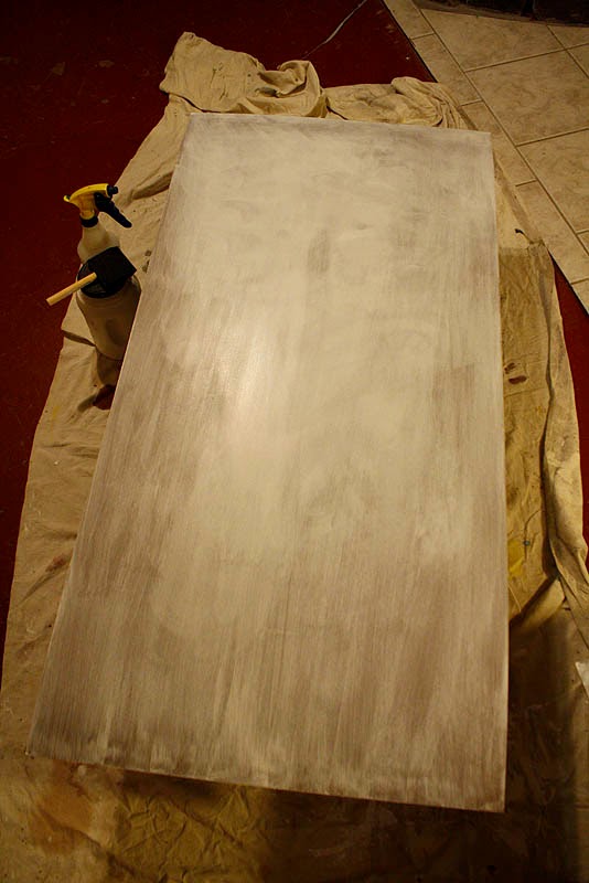
Once the choice is made, I have to begin with the preparing of the support and ground of these paintings.  This can be very personal to each artist, and really depends on what medium you want to use.  I know that these will be oil paintings so stretched canvas, wood or masonite are my most realistic options.  


I choose to work on 1/8 inch masonite.  This is a medium that I'm familiar with and have worked with extensively.  I like this support because it is readily available, and is easy to customize in size and surface.  I start with two 24"x48" sheets of masonite and begin with soaking the board with a spray bottle and then washing on a first coat of gesso. 


 This coat is put on very wet with a sponge brush.  Continuous, gentle, soft brush strokes in cross hatching directions continues until the paint becomes tacky.  This in then left to dry overnight.  Its important to allow this drying time. The masonite will warp into a disturbing arc, but the overnight drying allows it to dry taught and flatten.  If you try to rush the drying time by putting it in the sun or in front of a heater, it will dry unevenly and the warp will not come out.


Day two the sheets are measured and cut into their desired dimensions for the triptych panels.  I actually get four 12"x32" panels and two 16"x24" out of the two sheets.  Another bonus of the 1/8" masonite is that it can be cut with a utility knife. ( with some elbow grease)  As a student or working in a small studio this is a big advantage because with wood or 1/4" panel you will need a circular or table saw.  The sized panels are sanded.


 A second coat of un-watered-down gesso is put on with the same technique using a sponge brush.  For a fine smooth finish the brush needs to be undamaged.  Any flaws in the brush's edge with create streaks and ruts in the surface.  This thick liberal coat painted on using ever lighter and lighter cross hatching brushstrokes until the paint is tacky.  Allow this coat to likewise dry overnight for even drying.

On day three I like to use a large block sander with a fine grit in a circular motion to sand the gesso into a smooth egg-shell surface.  Sanding sponges of varying grit are also available for this application.  You can vary the texture of the surface at this stage.  In some images I've done where I know the details of the composition before I begin I can apply gesso paste or gel to create texture for rocks or grass etc, but also sand the areas where the faces and details will be perfectly smooth.  It will take at least another day or two (depending on humidity) for the panels to completely dry.


With the gesso dust washed off and the triptych panels placed on my easel with all my inspiration reference and sketches I'm ready to start painting.

I still have not decided on which three compositions I will render, but since these are personal paintings I will give it some time to consider the triptych both as a set and as individual images.  The next  oil sketch stage will be done with the panels together.  With the panels prepared and waiting I can begin any time that inspiration strikes, until I find a break in my schedule, or procrastinate until the eleventh hour.

Thanks for following, and keep checking back to see the next stage.  I'm interested to see what happens.

WOC


Scroll Landscape: Part 3

$
0
0
William O'Connor

I have spent some time imagining the triptych landscape series. I've begun to approach the images from a purely thematic basis.  I have decided that the trilogy will have the theme of focusing on the character of  Gandalf.

Designing the three panels together allows me to compose three individual images that will work as a set or individually.  Working very loosely with oil paint washes allows a free-form sketching process open to a great deal of alteration and manipulation as I proceed.  This is the part of painting I enjoy the most.  It looks like a mess, but this is where I'm making the important decisions!

I decide that the two panels to the left and the right should be compositionally similar, echoing one another.  The left hand panel being Gandalf leading the Fellowship of the Ring into the Mines of Moria.  The right side panel should be Gandalf and the Heroes of the Ring departing Middle Earth from the Gray Havens.  In the Middle, the fulcrum of the story arc, being Gandalf standing at the Gates of Minis Tirith fending off The Lich King.

Compositionally the two bookends should echo one another in design, with angular forms, while the center panel will represent Gandalf the White in his full splendor and moment of greatest power!

This is still being sketched and conceived as I proceed, so may very well change dramatically.  I'm of a mind that the center panel should be larger in the tradition of catholic alter pieces, but that would mean starting that panel over again.  Something that an artist must consider, not to be limited by your medium...

Stay tuned.


Enjoy


WOC


Scroll Landscape: Part 4 (The Gandalf Triptych)

$
0
0
William O'Connor

The scroll trilogy paintings are starting to come into focus.  I think I can officially rename the piece from the ambiguous "Scroll Landscapes", to "The Gandalf Triptych."

In order to echo more of a Japanese aesthetic, I consider the concept of including a frame painted into the design.  I have never done this before, and I'm not sure on how it will be fulfilled, (whether a painted frame or applied graphic or even gold gilding.)  But I've masked off the appropriate surround with tape to include this into the design. If this concept does not work out I can always paint over it later.

Pressing onward I begin the "Pushing Paint" phase of my painting.  This is just what it sounds like and is just as fun.  Since all three pieces are to be interrelated, I'm painting them together, and once again being influenced by my Japanese source material, I'm picturing a very monochromatic gray tonal image for all three. 

Gray-Blue-Green.  This is a great undertone for covering the canvas.  It lends itself to tonal mood, and atmosphere, while can also be easily punctuated with colors leading into the purple-violet-red scale allowing popping orange-yellow highlights of fire and light to accent the design.  This will also stand out very nicely with the envisioned gold-gilt framing.

Here I'm pushing the design's value scale from mid tone washes into a misty cool background with deep rich foreground elements.  This "Pushing Paint" stage is still very abstract and loose.  My intent is to get the entire canvas covered with paint.  This is not one of those paint-by-number paintings, where you first paint the face, then paint the tree, then paint the cloak, then paint the hair, etc. and follow the steps until its done.  I'm designing as I go, carving and softening edges and shapes and forms out of paint until the positive and negative elements work individually and as a triptych.  This is both thumbnail and painting at the same time.  The lump of clay beginning to take shape.  I'm trying to create a mirror image in the left and right panels, with the Mines of Moria and the Ruins of the Gray Havens having similar shapes. The central panel is symmetrical.

Still early days.  Keep posted to see what happens next!

Enjoy 

WOC


The Gandalf Triptych- Part 5

$
0
0
William O'Connor

Gandalf Triptych work in progress with rough layout of framing and display mock-up

It has been a bit over two months since my last update about the Gandalf Triptych that I've been working on in my free time.  Free time is something is hard to come by.  Currently proofing a new book due out in the fall and another due out in August has kept me busy and not painting, but as promised I have made progress.

I've moved into the Focussing Phase of the paintings.  This is where the design, lighting and underpainting is completed, and now its time to begin refining details and making smaller decisions.  This is one of the hardest parts of painting because what starts out as what appears to be a sloppy mess, begins to come into focus as a storytelling picture, and where I'm most likely to give up and put into my slush pile of unfinished work.

This is very much the adolescent phase of a painting, that every parent of a teenager knows all to well.  Conception was the easy part, the growing pains and sleepless nights of early childhood are over, but now its all clumsy, awkward,  emotionally distraught pangs of pimply shyness that argues with you at every turn.  You think it will never get its act together and turn out okay.  But, as every artist and parent will tell you, it all will be okay.  Every painting goes through that phase to become the mature, young adult you hoped it would be and you begin to see the adult painting it will become.

Here are a few pics of the triptych as they are now.  Click to enlarge and see details.

The next and final painting phase will be the Detail Phase where glazes and details are rendered to finish the pieces.  This will be the most time consuming, but least stressful, since all the creative decisions have all been made.

Enjoy


WOC

Grey Havens Pt.1
Grey Havens pt.2
The Gates of Minith Tirith

Cave of the Goblin King


The Gandalf Triptych-Part 6: Finish

$
0
0
by
William O'Connor


Finally Finished!!

Those of you that have been following the journey that I have been making with this painting for the past 6 months have been wonderfully supportive.  The Gandalf Triptych was completed and debuted at the Illuxcon Exhibition in October, and the reception they received was wonderful!  The set was sold to a private collector, and I shipped them off a couple of weeks ago to their new owner.

Its been many months since my last blog about this painting, because as I said, it would probably take as much time to complete the details as all the steps up to that point combined, which turned out to be true.  Details, Gold Border and Frames were all decided within the last month of the work.

I'm very pleased with the result.  This was a challenge that I gave myself to try to challenge what I could do as an artist.  Three paintings that would would work individually and as a set.  There were points in the process where I considered quitting, but I slogged through it and finished what I started. Posting the process with no knowledge of the outcome was an added challenge.  I learned a lot along the way, I hope some of you did too about the work that artists put into their creations.  The painting is the work, and the final product is only the veneer of the process.

Enjoy.

WOC

Gandalf Triptych Part1 Mines of Moria
©2015 William O'Connor

Gandalf Triptych Part2 Minis Tirith
©2015 William O'Connor

Gandalf Triptych Part3 The Grey Havens
©2015 William O'Connor


 all images and text are © Copyright William O'Connor and William O'Connor Studios

20,000 Leagues Under the Sea

$
0
0
by 
William O'Connor


I am very excited to be able to share some of the work that I have done for my latest illustrated book 20,000 Leagues Under the Sea by Jules Verne.

This project has been under development for nearly 20 years!  I first read the book in 1995 and immediately became fascinated with the exciting imagery that Verne described in the text.  My first interest in the story was to see how accurate Verne had been in his wonderful descriptions.  I was surprised by how different the text was to all the previous depictions that I had seen during my childhood.  The story of Captain Nemo was much darker and more mature than the children's versions that I had experienced.  Also, Verne's detailed schematics of the ship, equipment and locations were so specific I wondered if they could be rendered based solely on his writings.

Beginning with the design of the Nautilus itself, I mapped the schematics that Verne related in the text down to the last detail and discovered that they made for an extremely believable ship.  The design that I rendered was word for word with he text, making a lovely vessel that was true to the story.

In the late nineties I had enough artwork to shop the idea to several publishers.  My result was editors responding saying that they liked the artwork, but that they already had an illustrated version of this classic.  My endeavor however was to create a full unabridged and illustrated edition which had never been done before.  Despite the rejections from publishers I continued to work on the idea for the next several years on and off.

Around 2010 I struck upon the idea of a Steam Punk version, seeing that genre becoming popular with the public.  Re-reading the text again for at least the fifth time I produced detailed schematics and some new artwork with this theme in mind.  In 2011 Sterling publishing contacted me to let me know they were interested.  They too were interested in the fact that an illustrated unabridged text had never been available and we soon contracted the book to be completed.

The research and creation of the hundreds of pieces of artwork to be included in the book was daunting but enjoyable.  I wanted the book to have the same feel of the great Golden Age of Illustrations classics by Pyle and Wyeth.  It has been a long road to see this book come into production, but one that I hope the readers will appreciate as much as I did creating it.

Enjoy.

WOC

to purchase this book visit:

Amazon    


Barnes and Noble 


Viewing all 60 articles
Browse latest View live